Building the 2026 El Niño Kelvin wave tracker
You can’t see a Kelvin wave with your naked eye. Out on the equator, it lifts the sea by only a few centimeters, while about 150 meters down it pushes the bottom of the warm layer down by several meters. Yet each one crosses the Pacific: a pulse of warm water traveling east along the equator, more than 10,000 kilometers in about two months. At South America it splits and runs along the coast in both directions, raising the sea at harbors by six inches to a foot for weeks at a time, and can travel all the way to the Gulf of Alaska, as Dillon Amaya explains. El Niño years can send them one after another, and NOAA expects this year’s El Niño to be strong.
No single instrument or sensor can perceive the whole wave. If you combine an ocean model, a line of buoys along the equator, and 66 tide gauges, however, the waves emerge from the data. I wanted to visualize these waves crossing the Pacific, built from public datasets.
So I built a 3D globe visualization that tracks them.
In this post, I’m going to cover how I built this visualization. I had two goals - first, I wanted the visualization to be grounded in data: every number and date on the page comes from a measurement or a published source. Anything that’s an estimate or set by hand is labeled. Second, I wanted it to be interactive and simple to use: a 3D globe which smoothly plays through the whole year, whether on a laptop or phone.
Overview
At a high level, the visualization works like this. I built Python pipelines which pull ocean data from around a dozen agencies and pre-process it down into smaller data files. In the browser, a WebGL globe draws the data with custom shaders (small programs that run on the GPU), while a timeline plays the season from early February to October (at the time of posting).
This post is broken down into four parts:
- The data and the pipelines
- Finding the waves
- Drawing the globe
- Keeping the visualization honest
Part 1: The data and the pipelines
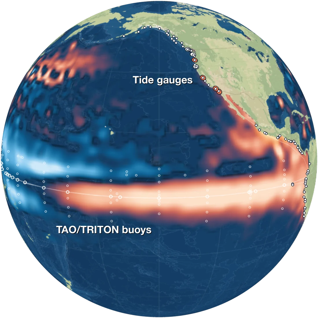
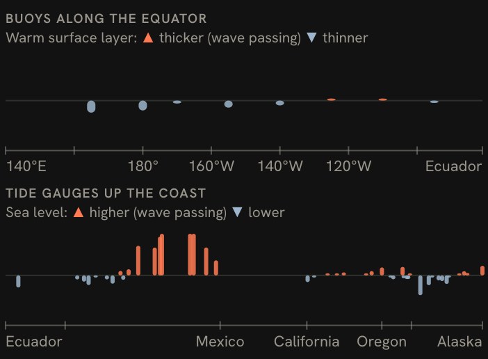
Each data source captures one part of the Kelvin wave: the ocean model maps the sea surface, the buoys measure the warm layer at points along the equator, and the tide gauges record it at the coast. The Data panel, shown below, presents the three side by side.
The sources:
- Sea level from an ocean model. This comes from Copernicus Marine’s 1/12° global ocean model, which combines satellite, buoy, and float measurements and fills in a complete map of the ocean daily.
- Satellite sea level. Merged daily from the altimetry satellites, as a measured cross-check on the model.
- Buoys. The TAO/TRITON moorings along the equator, which measure how deep the warm layer of water reaches.
- Tide gauges. 66 of them from Peru to Alaska and the Galápagos: NOAA’s, raw gauges through UNESCO’s IOC, and the Canadian Hydrographic Service’s.
- El Niño indices. NOAA’s ONI and the newer relative index, RONI, which NOAA adopted this year.
- The map itself. Ocean depth from NOAA’s ETOPO 2022, land from OpenStreetMap, and the stars from ESA’s Hipparcos catalog.
Each source has a separate pipeline: one Python module fetches raw data, caches it, and writes a JSON file. Most of those files record where the data came from, when it was generated, and the date range it covers.
Some of the raw model data is quite large, measured in gigabytes, which is unrealistic to render in a browser. The pipelines average the sea level into 1° squares and 5-day steps, subtract the 1993–2022 normal for each month (minus the slow sea-level rise, so the colors show this year’s El Niño rather than decades of rising seas), and then keep only what the page renders. By doing this, each data file the browser loads is instead only a few megabytes - far better for visualizing in a web browser. That keeps the page fast, and the pipelines allow me to trace what is shown in the visualization back to source-of-truth data.
Part 2: Finding the waves
The hard part of the visualization wasn’t just drawing the ocean. The challenge was accurately finding the Kelvin waves in the data.
El Niño’s slow warming is close to ten times larger than the Kelvin wave riding on top of it. So the first step is a filter that keeps only changes lasting 20 to 120 days (a Lanczos band-pass). The slow rise drops out, and the wave stands out. Then a second filter, near the equator, is applied to keep only what’s moving east, which removes the westward-moving waves in the same water.
From that point, each wave gets a track fitted along the equator, allowed to slow slightly as it goes east; its slope is the wave’s speed, about 3 to 3.5 meters a second, or about 10–13 km/h. The arrival date at Ecuador is the middle of four separate estimates: the ocean model, satellites, buoys and tide gauges. To count as a wave at all, a pulse has to stand out more than the same data randomly shuffled, and more than the best westward-moving track. That keeps noise from passing as a wave.
Once the wave hits the coast and begins to spread north and south, the tide gauge data takes over. Subtracting the predicted tide from the measured value leaves everything else that moves the sea. Low air pressure also lifts the sea (about 1 cm for every hectopascal or millibar), which can be removed using weather data, and then the same 20–120-day filter runs a second time. A stretch of coast only counts as the wave if its gauges peak one after another, moving away from the equator, at a speed a coastal Kelvin wave would typically travel (100–400 km a day). A storm can raise one gauge at any time, but a traveling Kelvin wave would raise them all in sequential order.
Part 3: Drawing the globe
The globe is built on deck.gl, a WebGL map library, and uses d3 for the charts and dates. deck.gl handles the map projection, the camera, the layers, and the hover tooltips. The more interesting parts are the custom code written on top of the framework to display this visualization data.
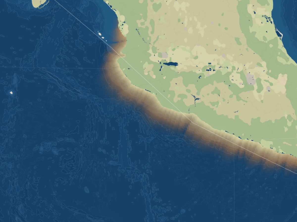
Custom shaders. The wave surface and the coastal wave are each drawn by a custom WebGL shader that reads data directly from data loaded onto the GPU (a texture). The wave surface is blended smoothly between grid points and shaded so it reads as a raised bump. The coastal wave follows the real coastline and fades out to sea. Between gauges with a clear signal, it’s an estimate and drawn in a softer style.
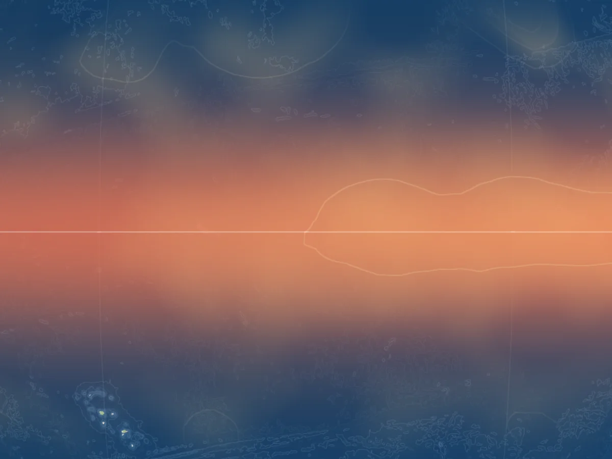
The per-frame contract. Sending data to the GPU on every frame can be slow; changing a few numbers the shader programs read on every frame (called uniforms) is fast. So, while the timeline plays, no frame is rebuilding complex geometry. Instead, each frame changes only a few small numbers to update the visualization: the current day, how far each wave has traveled, how much the camera has moved. The sea-level map swaps one small image every five days. This enables a much higher frame rate, which means the animation will play smoothly even though a great deal of data is being rendered.
Map tiles. To frame the visualization, I needed to create a few sets of custom map tiles based on open data. The tile layers (ocean depth bands, depth lines and OpenStreetMap land) are served as vector tiles (PMTiles, zoom 0–6). A background thread in the browser (a WebWorker) unpacks the data, and then each shape is cut on a 5° grid so it bends with the globe. Without that, the flat tile shapes would cut across the curve of the globe and leave visual artifacts.
The seafloor. The depth tiles start from NOAA’s ETOPO 2022, a global relief model with a depth value roughly every 2 kilometers. From it, a pipeline draws 15 depth levels: 200 meters, where the continental shelf drops away, then every 500 meters down to 6,000, then finally 7,000 and 8,000. The deepest band holds the ocean trenches, including the Mariana Trench, whose Challenger Deep is the deepest point on Earth, about 10,935 meters down. Each grid cell averages about 2 kilometers of seafloor, so there the grid reads about 10,540 meters.
Each zoom level gets its own geometry. The pipeline averages the grid into blocks about one screen pixel wide at that zoom, from 60-by-60 cells for the whole globe down to the raw grid when zoomed in, so the bands never carry more detail than the screen can show. This helps keep rendering efficient, as it prevents rendering excessive data at the wrong zoom level.
The depth contour lines, similar to contour lines on hiking maps, aren’t traced separately. They’re calculated from the shared edges of the ocean depth bands, so each line sits exactly on a color boundary. Bands are also matched across tile edges, so neighboring tiles will meet at identical points with no seams. On the globe, bands shade the ocean darker with depth, and the contour lines trace the ridges, trenches and sea mountains that the wave passes over.
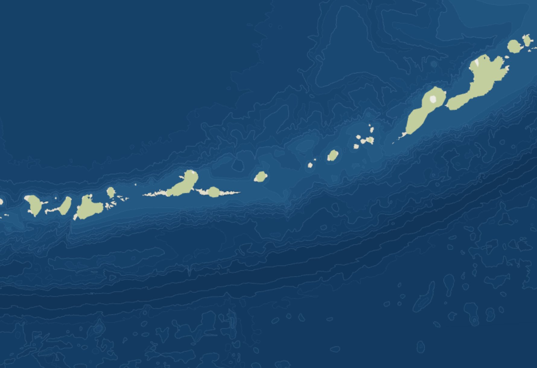
The Aleutian Trench: the lines bunch together where the floor drops off.
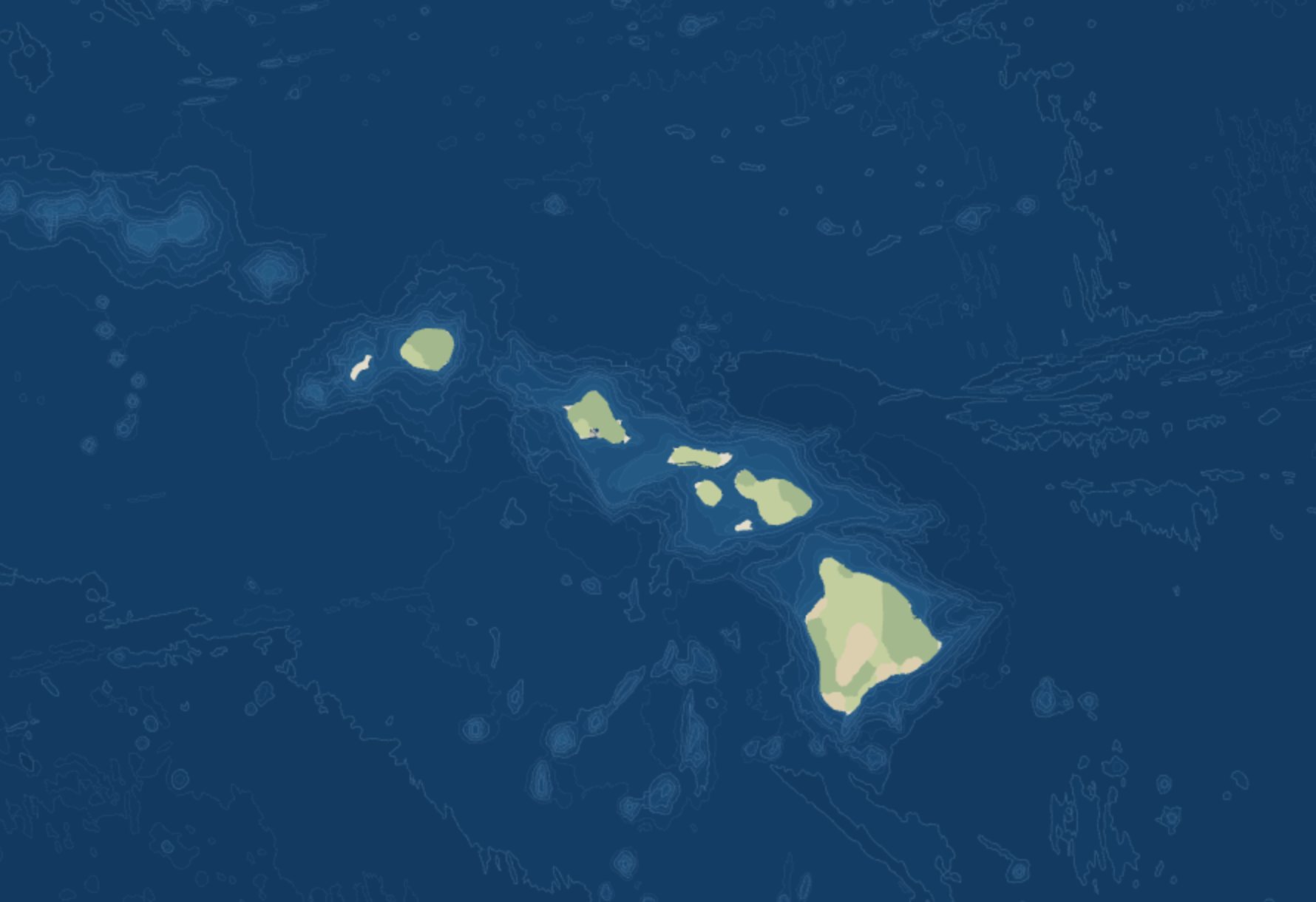
Hawaii: each island sits on a ridge, with seamounts around it.
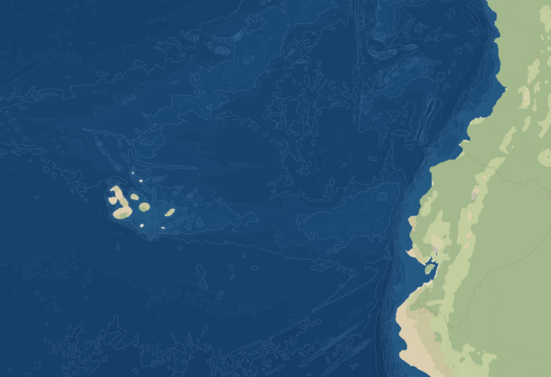
The Galápagos and Ecuador, where each Kelvin wave reaches South America.
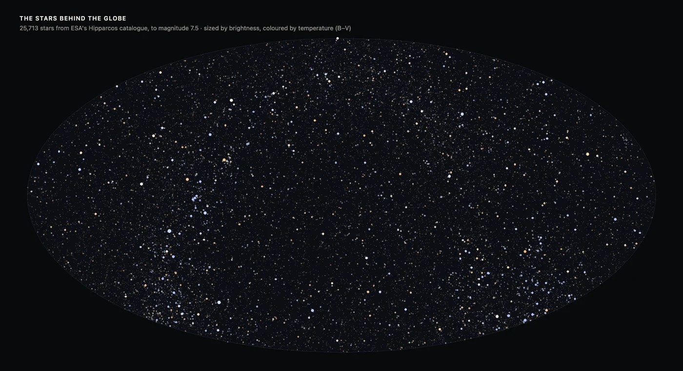
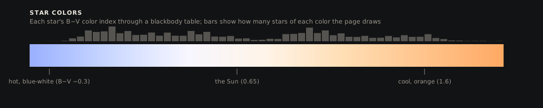
The starfield. Behind the globe is the real sky. Over 25,000 stars are individually rendered as points based on their position in the Hipparcos catalog. Stars were selected down to a magnitude of 7.5, which is about the whole sky when viewed with your naked eye (outside of a bright city, anyway). Stars carry their position, brightness, and measured color index - from the blue-white of hot stars to the orange of cool ones.
Behind the starfield is NASA’s Milky Way map, built from the light the Gaia satellite recorded from 1.7 billion stars. The Milky Way itself is an image, stored as a cube map: six square faces of a cube around the camera, and each pixel on screen looks up the face its direction passes through.
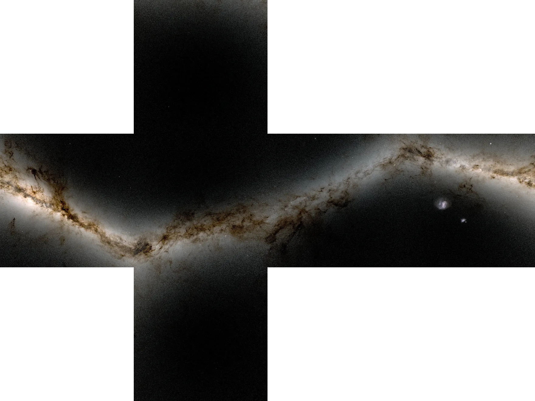 +y−x+z+x−z−y
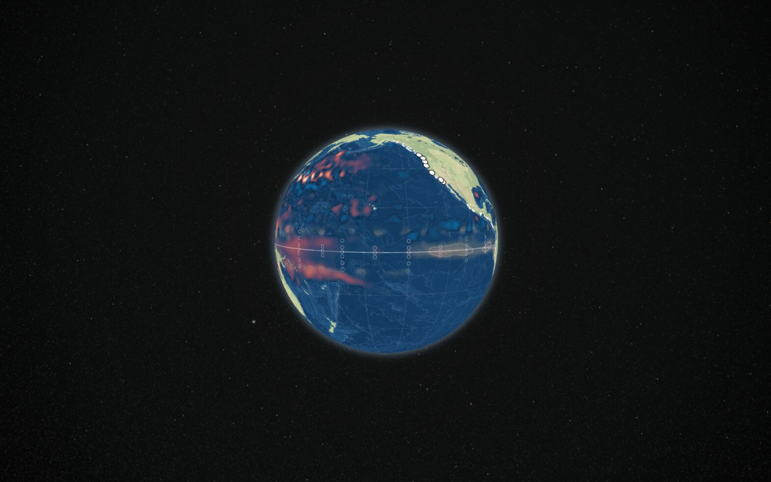
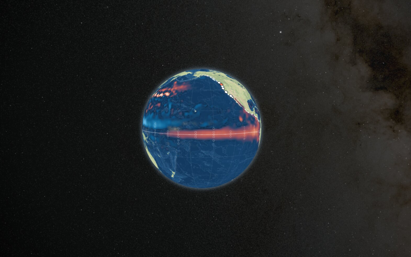
The sky also keeps time with the timeline. For each date, it’s turned to where the stars stand at midnight UTC. Because the Earth moves along its orbit, the same clock time faces a slightly different direction in space each day, so as the visualization plays the sky drifts approximately one degree a day. Like everything else on the globe, it changes only a few numbers per frame, and it’s drawn through the globe’s own camera, so the sky moves accurately as you pan and zoom.
Part 4: Keeping the visualization honest
Having confidence that all of this data was rendering correctly was the part that took the most time.
Grounded in real sources. Every claim on the visualization carries a citation, more than 70 sources in all: NOAA’s weekly updates, the ocean model’s documentation, papers going back to 1979, and news coverage of this year’s El Niño.
Validation. Every measured dataset has a validator that recomputes a few numbers independently and compares them with a reference: the satellite sea level recomputed from raw files, tide gauges against the University of Hawaii Sea Level Center, and stars against the SIMBAD database. Every data source has also been through multiple adversarial reviews, which I cover in more detail below.
Closing thoughts
This visualization was built the way most software is now built in late 2026: alongside teams of AI agents. I’ve built geospatial visualizations for much of my career, almost 15 years, so I knew what I wanted to see and how it should be assembled: heavy processing up front in Python, last-mile work on background threads in the browser, custom WebGL shaders for GPU-accelerated playback, and performant charts to show different perspectives into the data.
Once I finished describing and planning an aspect of the visualization, agents took over and did the building. After each round, I’d task additional agents as adversarial reviewers - reading everything, recomputing the derived data independently, trying to find problems in methodology, and reporting anything that didn’t match. This goal-driven process caught a number of data errors early. I also had teams of adversarial agents tasked with performance concerns - benchmarking performance across devices, verifying frame rates, and proposing optimizations. One key rule in the project’s instructions was a north star for myself and the agent teams: every visual property on the page must clearly map back to a measured or cited quantity.
This style of building let me focus on the story I wanted to tell, the visual language, and the architecture. Agents are incredibly fast at building well-defined and verifiable tasks, but the slow, valuable part is deciding, checking and cutting. Like any visual design exercise, much of the work was removing what didn’t serve the story.
It’s similar to what I wrote in “Times are changing”: the gap between being curious about something and building it keeps shrinking. My curiosity about how a few centimeters of water cross an ocean became a sourced, reviewed, tested visualization over a few weeks of early mornings and late evenings.
The coastal wave isn’t done. In his October 12 Weather West post, Daniel Swain puts California’s coastal water levels 1–2 feet above the tide predictions, with 9–12 inches of that from the coastally trapped Kelvin wave, and flags the king tides of late November, late December and late January as the times to watch.
There’s still more data I’d like to add. NOAA reported a wave that started in December 2025, so I’d like to extend the visualization earlier in time. I’d like to add animated winds, to help show how the winds launched these Kelvin waves.
I hope to publish updates soon. Either way, please check out the waves.
Get in touch
If you work in this field and have ideas about how I might improve this visualization, or wish to discuss it further, please reach out. I’d love to chat. Enjoy!
Sources
The main data and background behind the visualization:
- Sea level: Copernicus Marine Service, the GLORYS12 reanalysis and the global ocean analysis, checked against satellite altimetry.
- Buoys: NOAA PMEL’s TAO/TRITON array.
- Tide gauges: NOAA CO-OPS, the IOC Sea Level Station Monitoring Facility and the Canadian Hydrographic Service.
- El Niño indices: NOAA Climate Prediction Center, ONI and RONI.
- Coastal trapped waves: Dillon Amaya’s coastal trapped wave page and Amaya et al. 2022, whose equator-to-coast path through the same model the visualization uses as a cross-check on when each wave reaches South America.
- This season on the coast: Daniel Swain’s Weather West.
- The map and sky: NOAA’s ETOPO 2022, OpenStreetMap, ESA’s Hipparcos catalog and NASA’s Deep Star Maps 2020.
The full list of sources that the visualization uses can be found in the Sources tab.